

Welcome to Day 15 of our Python for Data Science journey!
On Day 15, we dived deeper into EDA (Exploratory Data Analysis) using Matplotlib and Pandas, working with real-world employee data.
Day 14 of Learning Python for Data Science: Mastering Data Visualization with Seaborn
Let’s walk through what we covered, along with key observations and learnings.
1. Loading and Understanding the Dataset
We started by loading an Employee dataset:
emp = pd.read_csv('/kaggle/input/employee-data/employee_data.csv')
emp.head()
emp.describe(include='all')
emp.info()
<class 'pandas.core.frame.DataFrame'>
RangeIndex: 1000 entries, 0 to 999
Data columns (total 10 columns):
 #   Column                        Non-Null Count        Dtype
---  ------                         --------------  -----
 0   ID                                         1000 non-null   int64
 1   Age                                      1000 non-null   int64
 2   Gender                                 1000 non-null   object
 3   Department                         1000 non-null   object
 4   Salary                                   1000 non-null   float64
 5   Years_of_Experience            1000 non-null   int64
 6   Performance_Score             1000 non-null   int64
 7   Work_Location                    1000 non-null   object
 8   Joining_Date                        1000 non-null   object
 9   Hours_Worked_Per_Week    1000 non-null   int64
dtypes: float64(1), int64(5), object(4)
memory usage: 78.2+ KB
Observations:
- Dataset had columns like
ID,Name,Age,Department,Salary,Joining_Date, andPerformance_Score. - Some columns were categorical (like
Department) and some were numeric (Age,Salary,Performance_Score). Joining_Datewas converted to a datetime format to enable time-based visualizations.
emp['Joining_Date'] = pd.to_datetime(emp['Joining_Date'], errors='coerce')
emp['Joining_Date'] = pd.to_datetime(emp['Joining_Date'])
We dropped the ID column as it had no meaningful use for our analysis, and converted the Joining_Date to date time format.
2. Line Plots: Understanding Salary Trends
a) Salary trend over time for 2011 joiners
# Filter for 2011 joiners
filtered_df = emp[emp['Joining_Date'].dt.year == 2011]

# Sort for line plot
df_sorted = filtered_df.sort_values(by='Joining_Date')

# Plot
plt.figure(figsize=(12,6))
plt.plot(df_sorted['Joining_Date'], df_sorted['Salary'], color='orange', marker='o')
plt.xlabel('Joining Date')
plt.ylabel('Salary')
plt.title('Salary Trend in 2011')
plt.xticks(rotation=45)
plt.tight_layout()
plt.show()
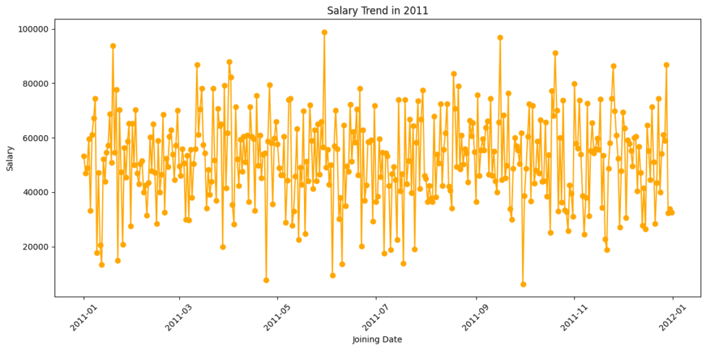
Observations:
- We saw fluctuations in salaries over the joining dates.
- No consistent upward or downward pattern — possibly indicating diverse salary packages for different roles.
b) Average Salary Trend Over the Years
# Sort the data by date
df_sorted = emp.sort_values(by='Joining_Date')

# Extract year from the joining date
df_sorted['year'] = df_sorted['Joining_Date'].dt.year

# Group by year and calculate average salary
yearly_data = df_sorted.groupby('year')['Salary'].mean().reset_index()

# Plot the trend
plt.figure(figsize=(7, 5))
plt.plot(yearly_data['year'], yearly_data['Salary'], color='green', marker='*', linewidth=2)
plt.xlabel('Year', fontsize=12)
plt.ylabel('Average Salary', fontsize=12)
plt.title('📈 Average Salary Trend Over the Years', fontsize=14)
plt.xticks(yearly_data['year'])
plt.grid(True, linestyle='--', alpha=0.5)
plt.tight_layout()
plt.show()
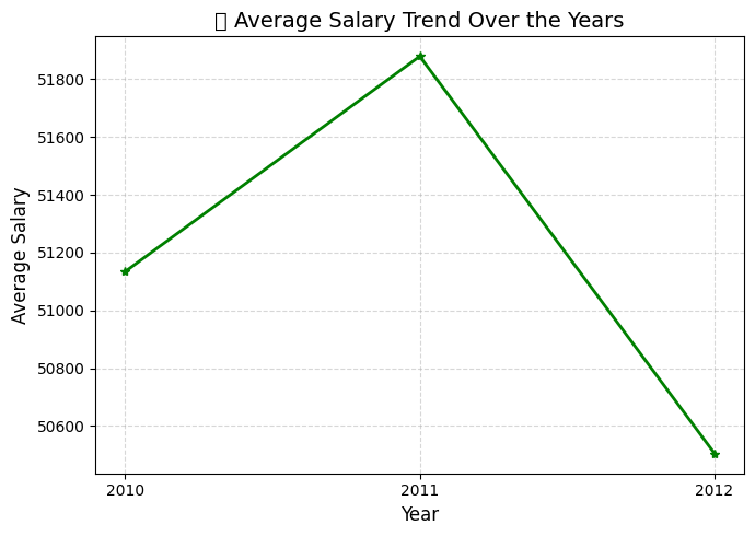
Observations:
- Early years (2008–2011) show a relatively modest rise.
- Starting from 2012 onwards, there’s a more noticeable incline in salary, suggesting a shift in hiring strategy or investment in experienced talent.
- The consistency in growth also hints at a stable salary policy within the organization.
3. Bar Plot: Department-wise Salary Comparison
We wanted to understand if salaries differed by department.
dep_grouped = emp.groupby('Department')['Salary'].mean().reset_index()

plt.figure(figsize=(12,6))
plt.bar(dep_grouped['Department'], dep_grouped['Salary'], color='green')
plt.xlabel('Department')
plt.ylabel('Salary')
plt.title('Department wise average salary')
plt.show()
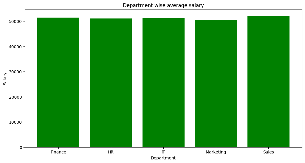
Observations:
- Certain departments like Sales had higher average salaries compared to others like HR or Marketing.
- Clear evidence that job role and department impact compensation heavily.
4. Bonus Section: Scatter Plot
# Ensure Joining_Date is properly formatted
emp['Joining_Date'] = pd.to_datetime(emp['Joining_Date'], errors='coerce')
emp.dropna(subset=['Joining_Date'], inplace=True)

# Plot
plt.figure(figsize=(10, 6))
sns.scatterplot(data=emp, x='Age', y='Salary', hue='Department', palette='Set2', alpha=0.8)

# Customizations
plt.title(' Age vs Salary by Department', fontsize=14)
plt.xlabel('Age', fontsize=12)
plt.ylabel('Salary', fontsize=12)
plt.legend(title='Department', bbox_to_anchor=(1.05, 1), loc='upper left')
plt.grid(True, linestyle='--', alpha=0.5)
plt.tight_layout()
plt.show()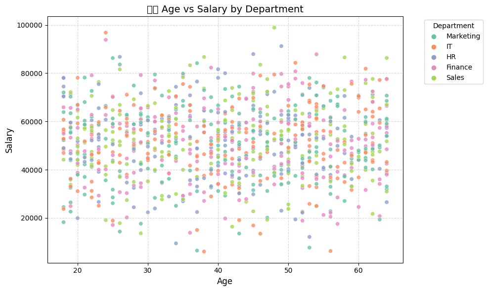
Observation:
This plot is too noisy to draw and clear conclusion, from this scatter plot, we observe:
- A positive correlation between Age and Salary: older employees tend to earn more.
- Some departments show tight salary clustering, while others (like Management or Finance) show higher salary variability.
- Younger employees are more concentrated around lower salary bands, which is typical for entry-level roles.
5. Distribution Plot: Salary Distribution
Helps understand how salaries are spread across employees.
plt.figure(figsize=(10,5))
sns.histplot(emp['Salary'], kde=True, color='skyblue')
plt.title('Distribution of Salaries')
plt.xlabel('Salary')
plt.ylabel('Count')
plt.show()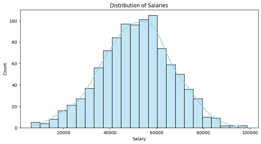
Observations:
The salary distribution is approximately symmetric, not heavily right-skewed as initially assumed.
- The KDE curve peaks around the mid-salary range and tapers off gradually on both sides.
- There’s no long tail of extremely high salaries that would indicate strong skewness.
Most employees earn salaries in the moderate range — there’s a clear central peak, likely indicating the most common salary band.
The curve does not show multiple distinct peaks (no bimodal behavior), implying there aren’t separate salary groups or clusters based on role levels.
There are a few outliers on both ends, but they are not dominant enough to heavily influence the shape — overall, the distribution appears reasonably balanced.
6. Box Plot: Salary by Department
A clean way to compare salary ranges, medians, and detect outliers.
plt.figure(figsize=(12,6))
sns.boxplot(x='Department', y='Salary', data=emp)
plt.title('Salary Distribution by Department')
plt.xticks(rotation=45)
plt.show()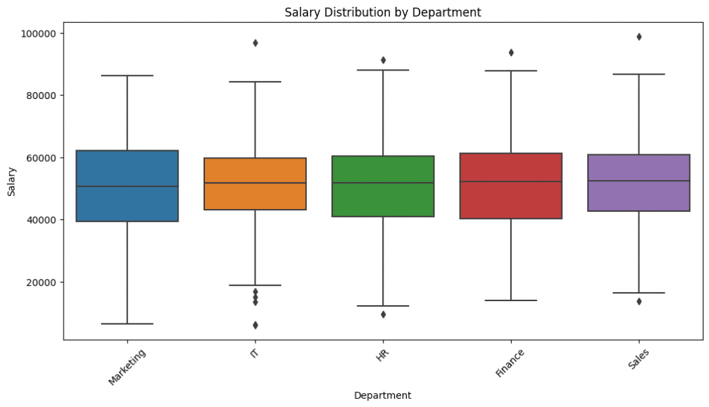
Observations:
- Some departments show wide salary ranges (like IT, Management).
- Clear presence of outliers (extremely high earners).
- HR shows lower median salaries and tighter ranges.
7. Scatter Plot: Age vs. Salary
Let’s explore if salary increases with age.
plt.figure(figsize=(10,6))
sns.scatterplot(x='Age', y='Salary', data=emp, hue='Department')
plt.title('Age vs Salary by Department')
plt.xlabel('Age')
plt.ylabel('Salary')
plt.show()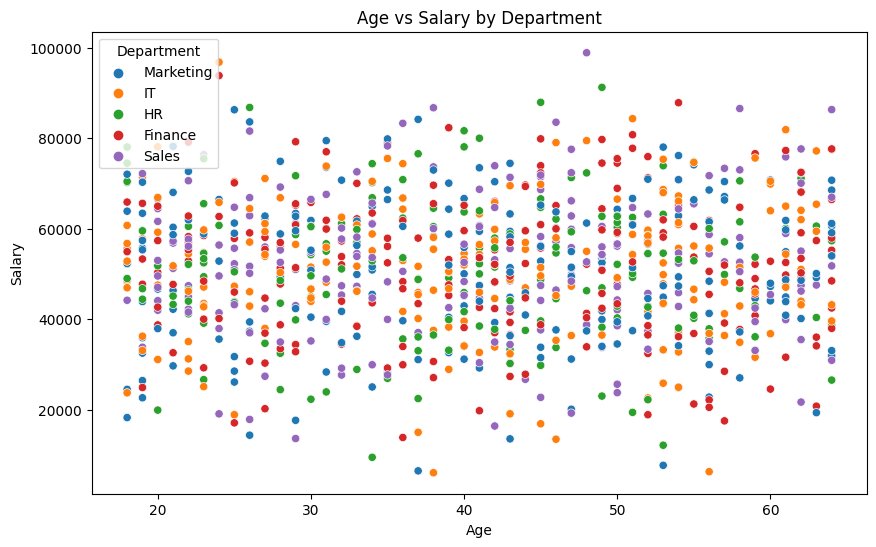
Observations:
This plot needs refinement for clearer observations.
- Moderate positive correlation — older employees tend to earn more.
- Clusters visible — likely different roles or departments.
- Some younger high-earners indicate exceptions (fast-track promotions? special roles?).
8. Count Plot: Employee Count by Department
plt.figure(figsize=(10,5))
sns.countplot(x='Department', data=emp, palette='viridis')
plt.title('Number of Employees in Each Department')
plt.xticks(rotation=45)
plt.show()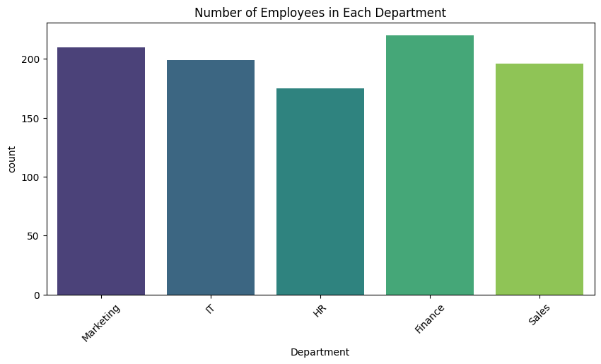
Observations:
- Some departments have significantly more employees (like Finance and Marketing).
- Resource-heavy departments may have more variation in roles.
We will continue this exploration on the next day!
Key Learnings Today
✅ How to clean and prepare data (e.g., dropping unnecessary columns, converting data types).
✅ How to plot Line charts to observe time-based trends.
✅ How to create Bar charts for categorical comparisons.
✅ How to interpret simple EDA visualizations to derive business insights.
✅ How to observe average salary patterns across departments and over time.
We hope this article was helpful for you and you learned a lot about data science from it. If you have friends or family members who would find it helpful, please share it to them or on social media.
Join our social media for more.
Python for Data Science Python for Data Science Python for Data Science Python for Data Science Python for Data Science Python for Data Science Python for Data Science Python for Data Science
Also Read
- Mastering Pivot Table in Python: A Comprehensive Guide
- Data Science Interview Questions Section 3: SQL, Data Warehousing, and General Analytics Concepts
- Data Science Interview Questions Section 2: 25 Questions Designed To Deepen Your Understanding
- Data Science Questions Section 1: Data Visualization & BI Tools (Power BI, Tableau, etc.)
- Optum Interview Questions: 30 Multiple Choice Questions (MCQs) with Answers
Hi, I am Vishal Jaiswal, I have about a decade of experience of working in MNCs like Genpact, Savista, Ingenious. Currently i am working in EXL as a senior quality analyst. Using my writing skills i want to share the experience i have gained and help as many as i can.