
Welcome to Day 14 of our Python for Data Science journey! Today, we explored Seaborn, a high-level Python visualization library that builds on Matplotlib. It’s an essential tool for any aspiring data scientist who wants to uncover insights hidden within the data.
Day 13 of Learning Python for Data Science: Mastering Pivot, Apply and RegEx
Why Learn Seaborn?
Seaborn offers:
- Intuitive Syntax: Simple, consistent APIs to plot data.
- Beautiful Styling: Comes with clean themes and color palettes.
- DataFrame Friendly: Works directly with Pandas.
- Statistical Visualization: Supports histograms, box plots, and more.
Creating a Sample Dataset
We first created a synthetic dataset using numpy and pandas:
import numpy as np
import pandas as pd

data = {
    'Age': np.random.randint(18, 70, 100),
    'Salary': np.random.randint(30000, 120000, 100),
    'Department': np.random.choice(['HR', 'IT', 'Finance', 'Marketing'], 100),
    'Performance_Score': np.random.uniform(1, 5, 100).round(1)
}

df = pd.DataFrame(data)
Visualizing Data with Seaborn
1. Histogram – Age Distribution
sns.histplot(df['Age'], kde=True, bins=10)
plt.title('Age Distribution')
plt.show()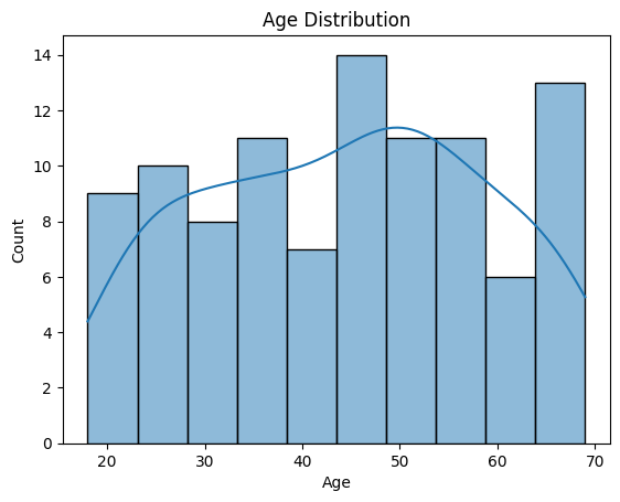
Observation:
- Most employees fall in the age bracket of 25–45 years.
- A smaller number are in the senior age group (>60).
- The KDE curve indicates a slight skewness toward younger employees.
2. Bar Plot – Average Salary by Department
sns.barplot(x='Department', y='Salary', data=df)
plt.title('Average Salary by Department')
plt.show()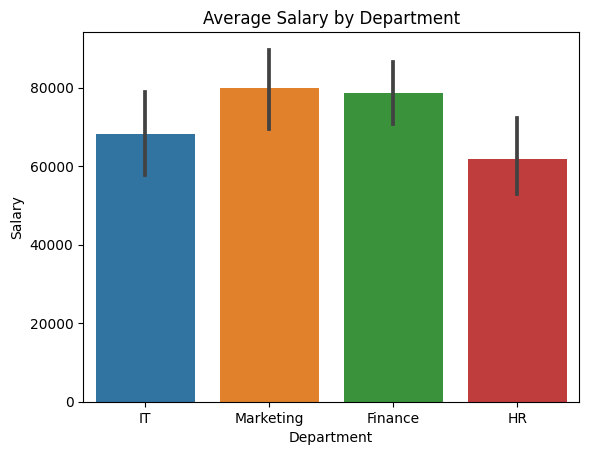
Observation:
- Marketing and Finance departments have the highest average salaries.
- HR shows the lowest average, which aligns with common salary trends across industries.
- The variation might hint at job seniority or experience levels in different departments.
3. Count Plot – Number of Employees per Department
sns.countplot(x='Department', data=df)
plt.title('Employee Count by Department')
plt.show()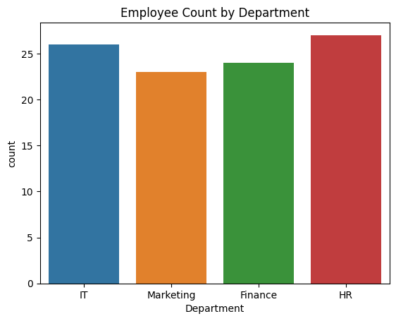
Observation:
- The employee distribution across departments is roughly uniform due to random sampling.
- This plot is useful for quickly checking class imbalance in real-world datasets.
4. Box Plot – Salary Distribution by Department
sns.boxplot(x='Department', y='Salary', data=df)
plt.title('Salary Distribution by Department')
plt.show()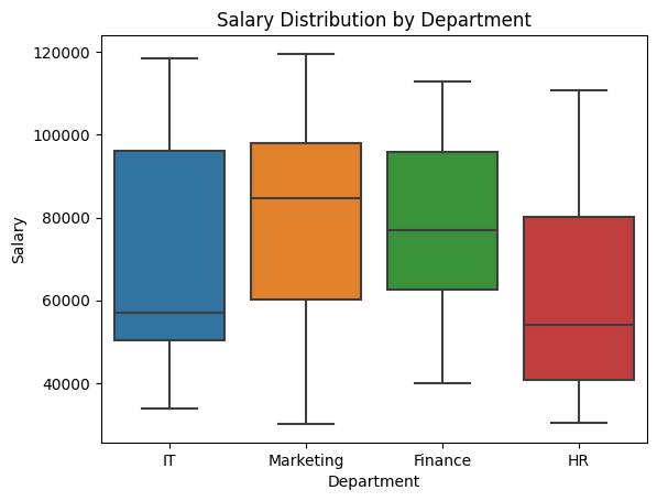
Observation:
- Salaries in IT and Marketing have a wider spread and higher outliers.
- HR shows a more compact distribution with fewer outliers.
- Outliers indicate employees with significantly higher or lower salaries in their department.
5. Line Plot – Performance Score vs. Age
sns.lineplot(x='Age', y='Performance_Score', data=df)
plt.title('Performance Score vs. Age')
plt.show()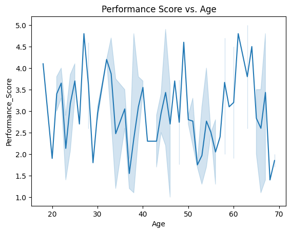
Observation:
- The relationship between age and performance appears noisy and not strongly correlated.
- A slight downward trend might suggest younger employees perform slightly better on average, but the variance is high.
- Could be explored further with a regression plot or grouped means.
6. Heatmap – Correlation Matrix
corr = df.select_dtypes(include=['number']).corr()
sns.heatmap(corr, annot=True, cmap='coolwarm')
plt.title('Correlation Matrix')
plt.show()
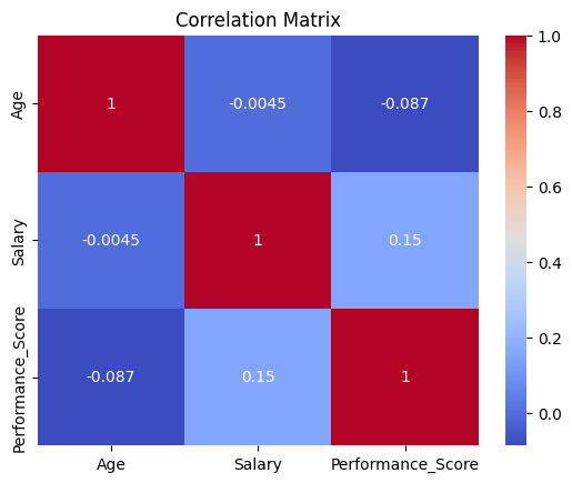
Observation:
- Moderate positive correlation between
AgeandSalary(~0.4–0.5), suggesting that older employees earn more, likely due to experience. Performance_Scorehas weak or negligible correlation with other variables, implying performance is not strictly tied to age or salary in this dataset.
Key Takeaways
- Seaborn is ideal for quick, effective data exploration.
- Visualizations provide instant clarity about distributions, relationships, and patterns.
- Each type of plot serves a specific purpose:
- Histograms for distributions
- Bar/Box Plots for comparisons
- Heatmaps for correlation insight
- Combining visuals with statistical summaries deepens your analysis.
Practice Exercises
- Plot a histogram for
Performance_Score. - Create a box plot showing how
Agevaries byDepartment. - Generate a heatmap for the dataset’s correlations.
Challenge:
- Add a new variable like
Education_Level(e.g., ‘Graduate’, ‘Postgraduate’, ‘Diploma’) and visualize how it influencesSalary.
What’s Next?
On Day 15, we’ll dive deeper into Matplotlib, which gives us more control over visual elements. This will empower you to create professional and customized plots for reports and dashboards.
Until then, keep practicing and exploring. The more you visualize, the better your intuition becomes for understanding data.
We hope this article was helpful for you and you learned a lot about data science from it. If you have friends or family members who would find it helpful, please share it to them or on social media.
Join our social media for more.
Python for Data Science Python for Data Science Python for Data Science Python for Data Science Python for Data Science Python for Data Science Python for Data Science Python for Data Science
Also Read
- Mastering Pivot Table in Python: A Comprehensive Guide
- Data Science Interview Questions Section 3: SQL, Data Warehousing, and General Analytics Concepts
- Data Science Interview Questions Section 2: 25 Questions Designed To Deepen Your Understanding
- Data Science Questions Section 1: Data Visualization & BI Tools (Power BI, Tableau, etc.)
- Optum Interview Questions: 30 Multiple Choice Questions (MCQs) with Answers
Hi, I am Vishal Jaiswal, I have about a decade of experience of working in MNCs like Genpact, Savista, Ingenious. Currently i am working in EXL as a senior quality analyst. Using my writing skills i want to share the experience i have gained and help as many as i can.